Most vocabulary apps are built around one assumption: that users will sit down and study. But that’s not how most people actually learn. This project started with a different assumption — that the best moment to learn a word is the moment you encounter it — and worked backward from there to design an app that fits into how people actually live.
This was a solo end-to-end UX project covering competitive research, proto-persona development, user interviews, task analysis, user flows, paper prototyping, usability testing, and iterated digital mockups.
The Problem
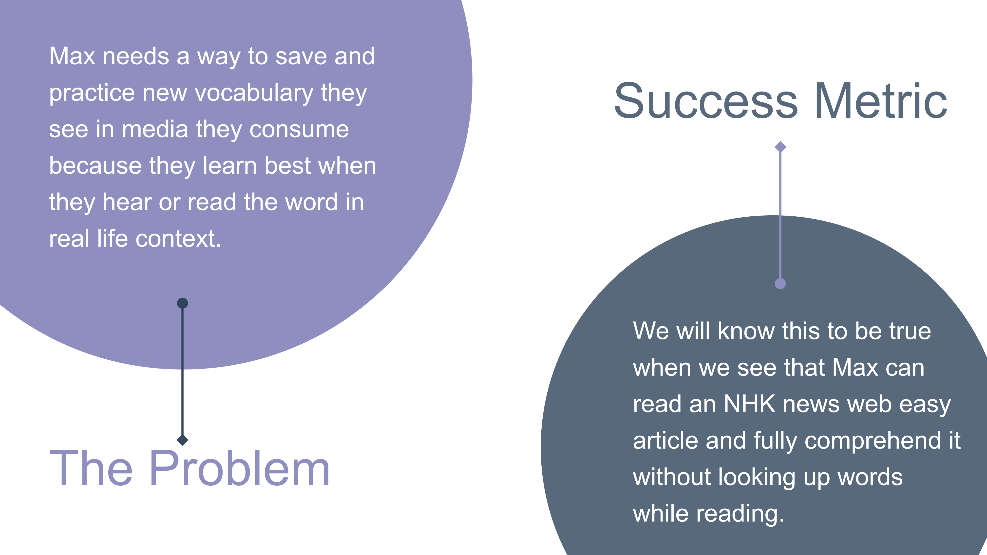
The challenge with vocabulary retention isn’t access to words — people have dictionaries in their pockets. The gap is between the moment you encounter a word and the moment you actually remember it. Existing apps treat these as separate problems: some help you create flashcards, some help you drill them, but none of them handle the moment of discovery itself in a way that’s fast enough to fit into real life.
My hypothesis going in: if I could design a way for users to capture words in the exact moment they encounter them — while reading an article, watching a show, scrolling social media — and then practice those words in the context they were found, retention would improve. The success metric I defined: a user like Max should be able to read a simplified Japanese news article and fully comprehend it without stopping to look up words.
Proto-Persona: Max
Before running user interviews, I developed a proto-persona to make my initial assumptions explicit and give the research something concrete to validate or challenge.
Max, 25 — Nurse, Seattle, WA
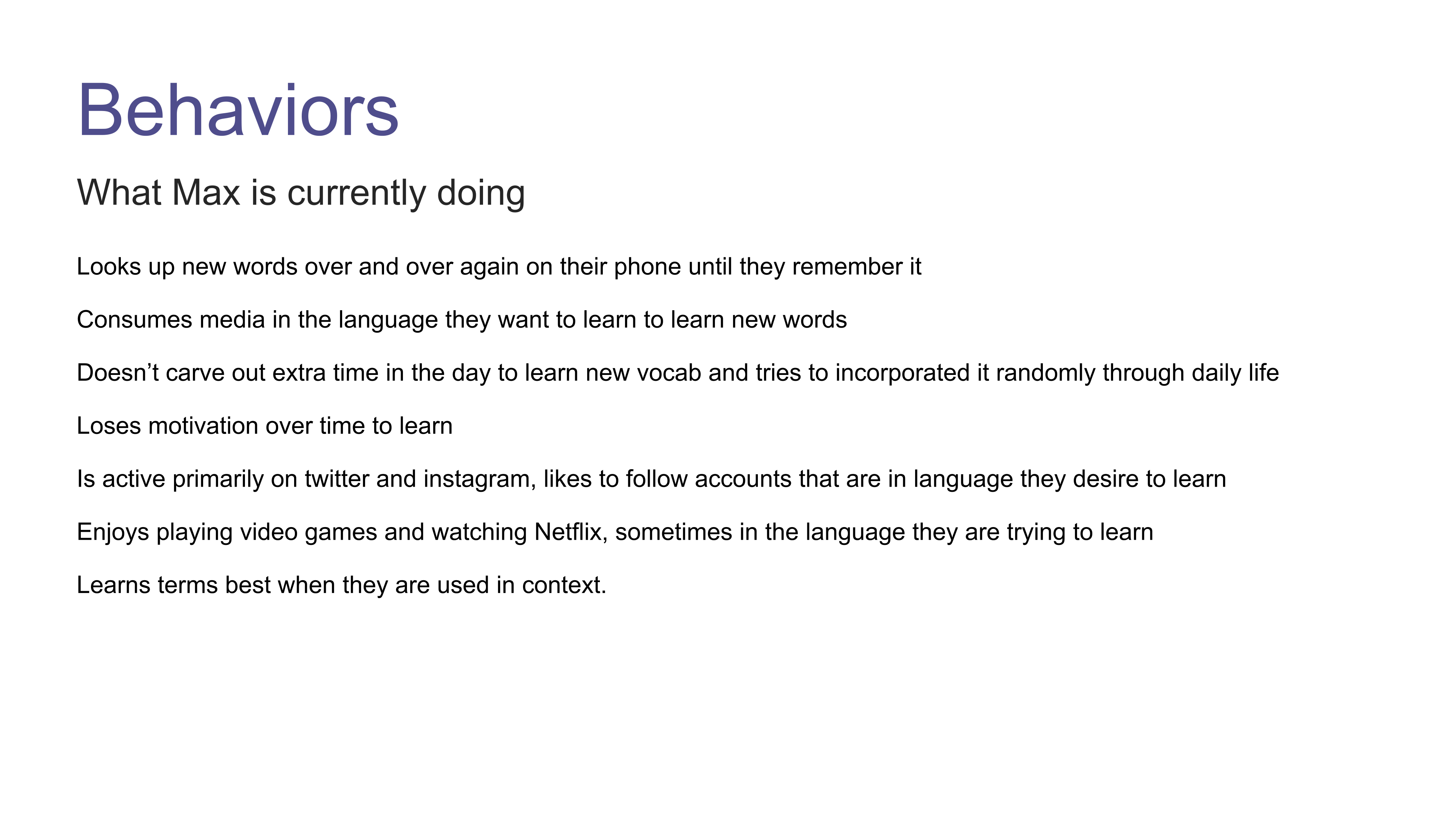
Max is bilingual in Spanish and English and is working to learn conversational Japanese — partly to connect with their Japanese heritage, partly to understand media they already consume in Japanese, and partly to be ready for a trip to Japan. Max doesn’t carve out dedicated study time. Instead, they try to incorporate learning into their daily life: following accounts in Japanese, watching shows in the language, looking up words they encounter repeatedly until they stick.
The core tension: Max learns best when they encounter words in real context, but there’s no good way to capture those moments. They end up looking up the same word five times before it sticks, or forgetting it entirely between encounters.
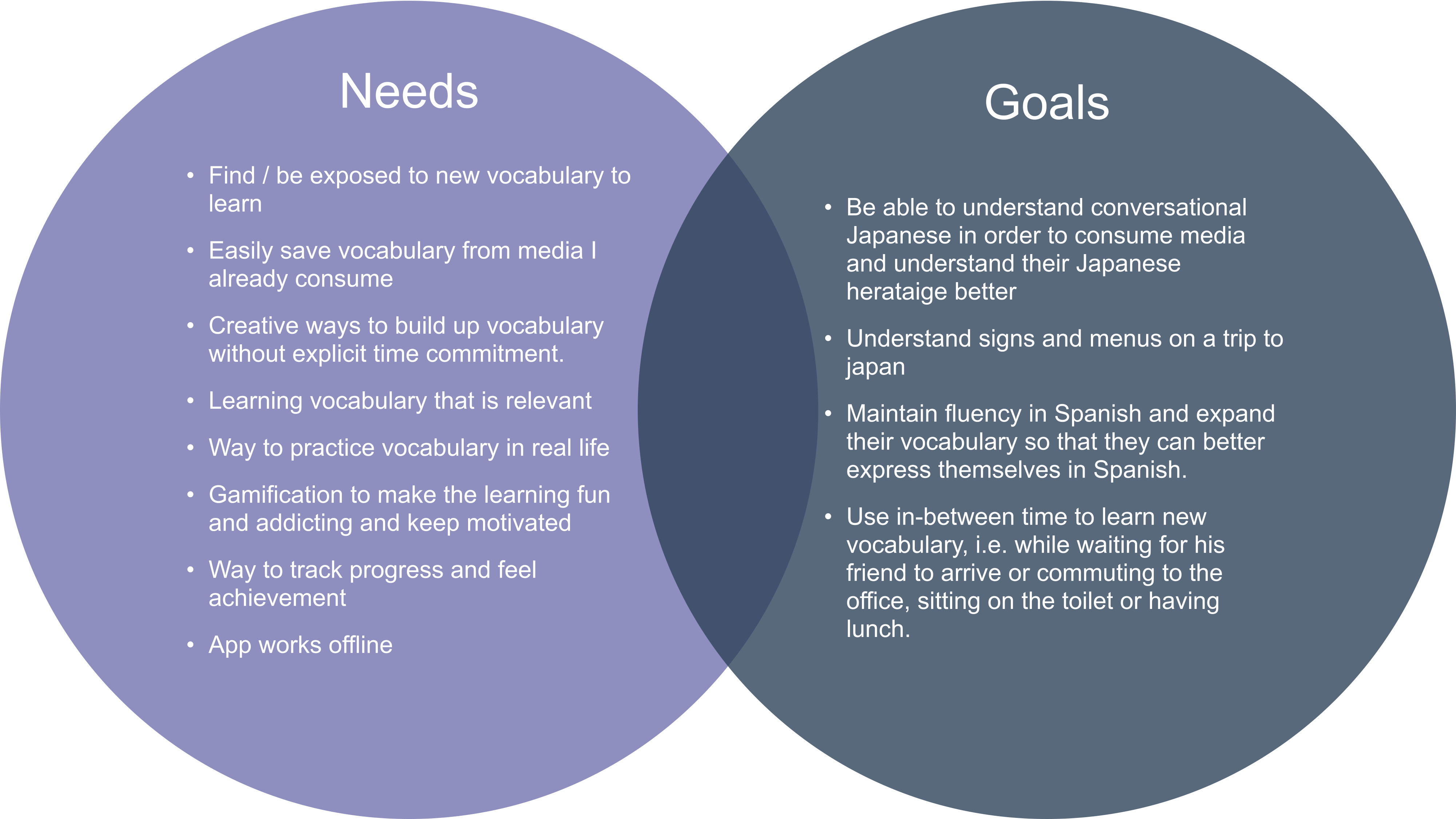
Max’s needs: A way to find and save new vocabulary from media already being consumed; creative learning that doesn’t require dedicated time blocks; gamification to stay motivated; progress tracking; offline access.
Max’s goals: Understand conversational Japanese well enough to consume media and connect with heritage; read signs and menus in Japan; maintain and expand Spanish fluency; use in-between moments (commute, lunch, waiting) for learning.
Competitive Analysis
I analyzed three direct competitors to understand what the vocabulary learning landscape already does well, and more importantly, where it consistently falls short.
Quizlet is optimized for institutional learners — students who need to build and study flashcard sets for specific classes or exams. Its strengths are real: premade deck recommendations, definition suggestions that save typing time, and a smart review system that focuses drill sessions on the cards you keep getting wrong. But it’s built for deliberate, scheduled study. There’s no first-time user guidance, the interface gets cluttered behind ads in the free tier, and there’s no mechanism for capturing words organically as you encounter them.
DuoCards came closest to the experience I was trying to design. It lets users watch videos and read articles inside the app and highlight words to save, and offers a browser extension for saving from external sites. The onboarding experience was the most thoughtful of the three. But it skews toward advanced language learners — beginners found it overwhelming — and the onboarding itself was long enough that users would zone out or skip it before reaching the features that made it valuable.
Chegg Prep proved that simplicity has real value. No ads, no paywall, a clean interface with no popups — users could just study. But it offers almost nothing for word discovery, no study reminders, and the UI looks unfinished. It solves the drilling problem cleanly, but does nothing for the discovery-to-retention pipeline.
The gap all three shared: none of them handled the moment of organic word discovery in a way that was fast enough for real life. DuoCards got closest with its browser extension, but even that required context-switching out of what you were doing. I wanted the capture flow to take five seconds and get out of the way.
User Interviews
With the competitive landscape mapped and a proto-persona in hand, I ran interviews with five people who actively work to expand their vocabulary, from different professional contexts.
Participants: Alice, 26, research assistant (voluntarily and involuntarily learns new terminology); Kim, 24, aerospace engineer (builds technical vocabulary for work); Tremaine, 26, project manager (focuses on communication and leadership language); Alicia, 24, tattoo artist (encounters artistic and cultural vocabulary organically); Maria, 24, subtitle translator (constantly acquiring new words to improve translation accuracy).
I organized findings using a Feeling / Doing / Thinking framework in Notion, tagging each insight to the participant it came from to track which patterns were individual vs. universal.
What I found:
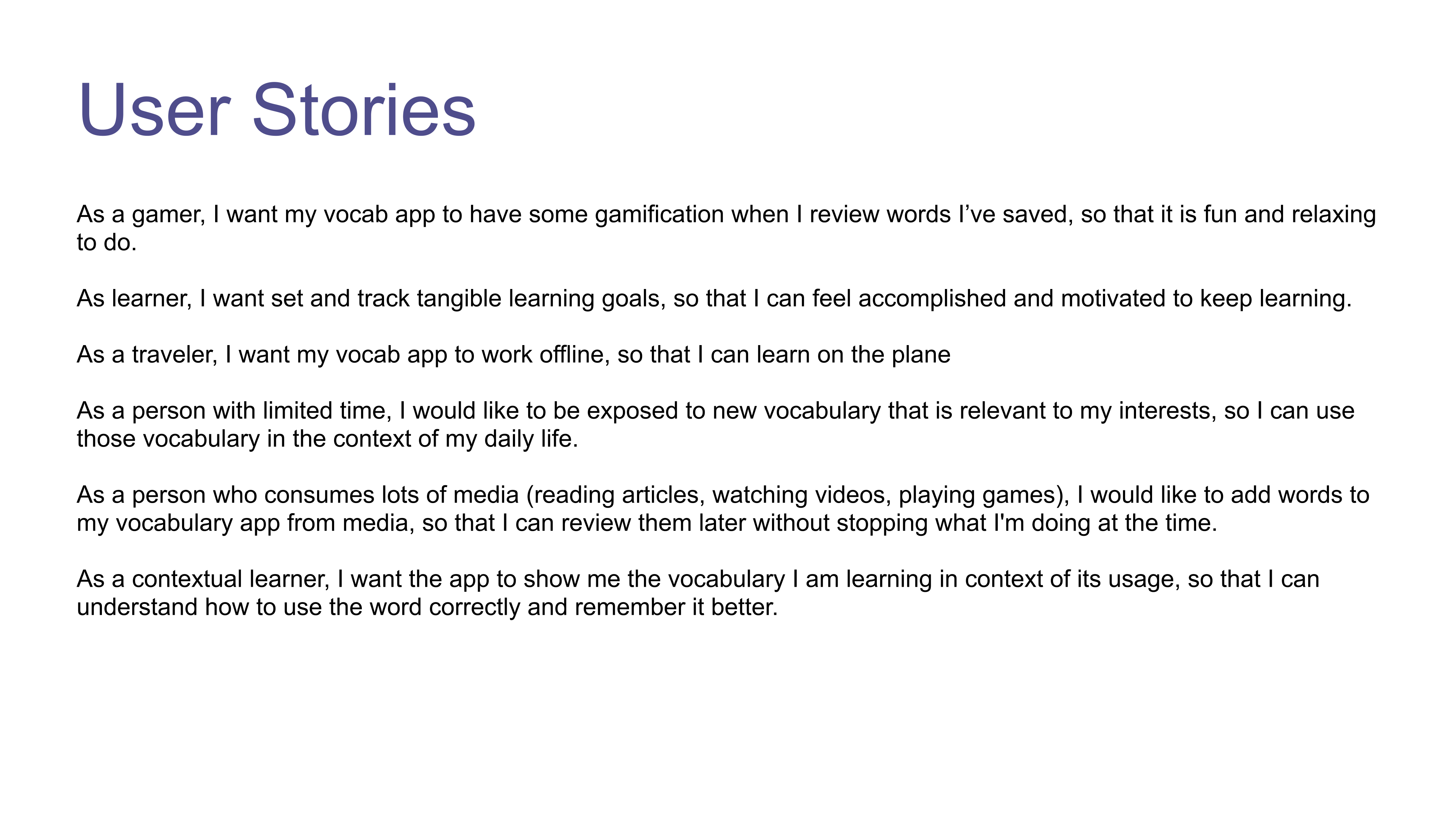
The feeling that came up most consistently was front-loaded excitement followed by declining motivation. Learning new vocabulary starts with a burst of energy — but when it feels repetitive or disconnected from real use, people drift away. Tremaine put it directly: “Learning is so gradual sometimes that I don’t feel the payoff of it so gamification gives me good feelings to feel immediate payoff.”
On the doing side, four of five participants said they consume media in the language they’re trying to learn as a primary learning strategy — and four of five said they lose motivation over time. The clearest behavioral pattern: none of them carve out dedicated study time. They learn in found moments, or not at all.
The thinking insight that shaped the design most directly: almost every participant, independently, said they retain words better when they encounter them in context rather than memorizing isolated definitions. Maria: “I feel like learning new words in context helps the word stick better in my head. If I can remember the context of the word then I can remember the word better.” This wasn’t just a preference — it was how learning actually worked for these users.
The three design questions this pointed to: how can the app keep users motivated over time? How can it make it easy to find new words to learn, especially from media they already consume? And how can it teach words in context, not just as definition pairs?
User Flows & Task Analysis
The interview findings pointed to two flows that mattered most to get right: capturing a word in the moment of discovery, and practicing saved words in a way that reinforced contextual learning.
Flow 1: Save a vocabulary word while in another app. Entry point is a mobile browser. The user highlights a word, selects “Look Up” from the text selection action menu (not “Save” — a distinction that would prove important in testing), reviews the dictionary definition in a modal, and confirms saving. The whole flow closes with a toast confirmation and returns them to whatever they were reading. The design goal: interrupt the user for as little time as possible, then get out of the way.
Flow 2: Practice saved vocabulary in context. Entry from the home screen. The user selects “Practice,” is presented with a fill-in-the-blank sentence using words from their saved set, selects from a word bank, checks their answer, and receives immediate feedback — with the correct sentence shown if they got it wrong. The session ends with a score summary and the option to practice missed words again. The contextual fill-in-the-blank format was a direct response to what the interviews surfaced: words stick better when you use them in a sentence.
Wireframing & Prototyping
I built the initial prototype as a paper sketch — fast to make, easy to test, and impossible for participants to feel bad about criticizing. The paper prototype covered the four tasks I planned to test: creating an account and going through onboarding, completing a vocabulary practice session, viewing account information, and saving a word from the browser.
The onboarding was the most complex piece to design because the word-capture feature — selecting “Look Up” from the text selection menu in your phone’s browser — was genuinely novel. Unlike most app features, users had no existing mental model to draw on. The onboarding needed to explain something they’d never done before, clearly, in a few screens, without losing them partway through.
The practice flow was more straightforward structurally — fill in the blank, check answer, continue, see score — but had interesting micro-decisions: what does the “incorrect” state look like without making users feel bad? How much context does the feedback screen show? What does the score summary offer at the end?
Usability Testing
I ran 10–15 minute usability testing sessions with three participants — Alice, Kim, and Tremaine, three of the original interview participants — using the paper prototype. I used a modified version of Jakob Nielsen’s error severity scale (0–4) to rate findings, which helped prioritize what to fix first versus what could wait.
What testing revealed:
The biggest finding, rated severity 4, was around the onboarding: users had no idea the word-capture feature existed or how to use it, and the onboarding screens didn’t explain it clearly enough. Alice took a moment to even notice that a word was highlighted in the onboarding example. This wasn’t a minor UX problem — it was the core feature of the app, and users were missing it.
The “Save” label in the text selection action menu caused consistent confusion across all three participants. Alice expected to copy or share into the app. Kim said “Save” didn’t tell her where it was saving to. Tremaine assumed most users would just copy-paste manually and open the app. The insight from Kim that landed hardest: she wanted to look up the word first and then decide whether to save it — so the action should say “Look Up,” with the save option appearing in the definition modal. This was a significant UX shift that made the flow much more intuitive.
The onboarding signup boundary was also unclear at severity 3 across multiple participants. Two of three couldn’t tell when they’d finished creating their account and when onboarding had started. A success state between the two would fix this cleanly.
In the practice flow, users wanted more feedback during the session rather than only at the end. Kim: “It was good to see how many questions I got wrong during the session but I’d like a tracker while I’m practicing instead of at the end.” And Tremaine wanted to be able to tap words in the practice sentence to see their meaning — a hint system that would make the contextual practice feel less like a guessing game.
Iteration: Before & After
Testing generated a clear set of changes, and I rebuilt the key screens in digital mockups to address them.
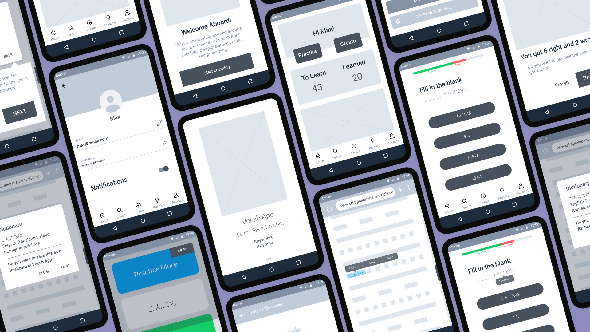
Onboarding: The paper version showed the Save modal first, then the Search tab, then the flashcard swipe interface. The revised version restructured around the most important insight: users need to understand the Look Up feature before anything else. The updated onboarding walks through the feature in the browser context itself — showing a real article, demonstrating the “Look Up” action in the text selection menu, showing the dictionary modal with pronunciation, translation, and romaji, then explaining the practice format and the flashcard review mode. It closes with a “Welcome Aboard!” screen that marks a clear transition from setup to the app.
Practice: The paper version showed feedback only at the end. The revised design added a live progress bar at the top of the practice screen — green for correct, red for incorrect — so users can see how they’re doing in real time. The incorrect feedback state now shows the correct sentence inline rather than a squiggly line placeholder (which testers had misread as a negative judgment). The score summary was cleaned up and now offers a direct “Practice” button to drill the words you got wrong.
Browser save flow: The “Save” action in the text selection menu became “Look Up.” The definition modal now shows the word, English translation, and romaji pronunciation, and asks “Do you want to save this as a flashcard in Vocab App?” — surfacing the save decision at the moment when the user has just reviewed the word and can make an informed choice. The confirmation changed from “Flashcard Saved” in a small toast to a full-width green banner that’s hard to miss.
Reflections
The proto-persona was a forcing function, not a prediction. Starting with Max made my assumptions explicit — that users learn from media, don’t study deliberately, and need low-friction capture. The interviews validated most of this, and having it written down meant I could tell the difference between insights that confirmed my model and ones that challenged it. The detail I hadn’t anticipated: how strong the motivation drop-off was, and how central gamification was to sustaining it. That pushed progress tracking higher up in the design priority than I’d initially placed it.
The most important UX fix came from one participant’s offhand suggestion. Kim’s observation that she’d want to “Look Up” a word before deciding to save it — modeled on how Amazon Kindle handles word lookup — restructured the entire browser capture flow. It made the feature less presumptuous (not every word you look up needs to become a flashcard) and more intuitive. Sometimes the clearest signal in user testing is a quiet throwaway comment that turns out to reframe everything.
Designing for a novel interaction requires extra onboarding investment. The word-capture feature — triggering a dictionary modal from the native text selection menu — was the most technically creative part of the design, and it was the part users understood least from the initial prototype. The severity 4 finding from testing was a useful reminder: the more novel the feature, the more explicitly you need to teach it. An innovative interaction that users can’t find or understand is just a broken interaction.