
PlutoPay is a responsive web app designed to give users a secure, unified place to manage their payment methods and make transactions online — without needing to carry or juggle multiple physical cards. This was a solo end-to-end UX project, from research through high-fidelity prototype, completed as part of my CareerFoundry UX/UI Design certification.
The project received strong recognition from peers and instructors, and it was also an inflection point for me personally: coming in as a front-end engineer, designing with accessibility annotations from the start was something I could bring to the project from day one — and it shaped how I think about the design-to-engineering handoff to this day.
The Problem
People who manage multiple payment methods online deal with a fragmented experience: different cards saved across different sites, no unified view of spending, and no easy way to set limits before hitting them. For users who are unbanked or prefer not to use traditional financial institutions, the gap is even wider.
Research and Discovery
Before designing anything, I needed to understand the business constraints, what competitors were already doing well (and poorly), and what real users actually needed from a payment app. These three angles shaped every major design decision.
Business Requirements
I started by defining a clear set of business requirements to align the project scope — who PlutoPay was for, what it needed to do, and what success looked like. Getting this documented first meant design decisions could be evaluated against real criteria rather than gut feel. From there I moved into competitive research to understand the landscape I was designing into.
Competitive Analysis
I analyzed PayPal and Google Pay as the two dominant players in the space.
PayPal’s core transaction flow is genuinely well-designed — two or three clicks from product page to payment confirmation, with a preselected default payment method. That simplicity was a bar PlutoPay had to match or beat. The gaps are in trust and transparency: users frequently report funds being held without clear explanation, and there’s no meaningful budgeting feature to help users stay on top of spending.
Google Pay’s checkout experience is arguably smoother for Chrome users — no re-login required if you’re signed into the browser. Its spending tracker is a genuine strength. But its biggest UX problem is a split identity: Google Wallet and Google Pay have overlapping functions that confuse users about which to use and why. Poor in-app customer service and reliability issues compound the friction.
What this told me: PlutoPay needed to match the simplicity of PayPal’s transaction flow, be transparent where competitors are opaque, and add the budgeting controls that neither competitor does well.
User Research
With competitive context in hand, I ran user interviews to validate assumptions and surface needs I hadn’t anticipated. My goals: understand how people currently manage their payment methods, what they like and dislike about existing apps, and where they run into friction.
Affinity Mapping
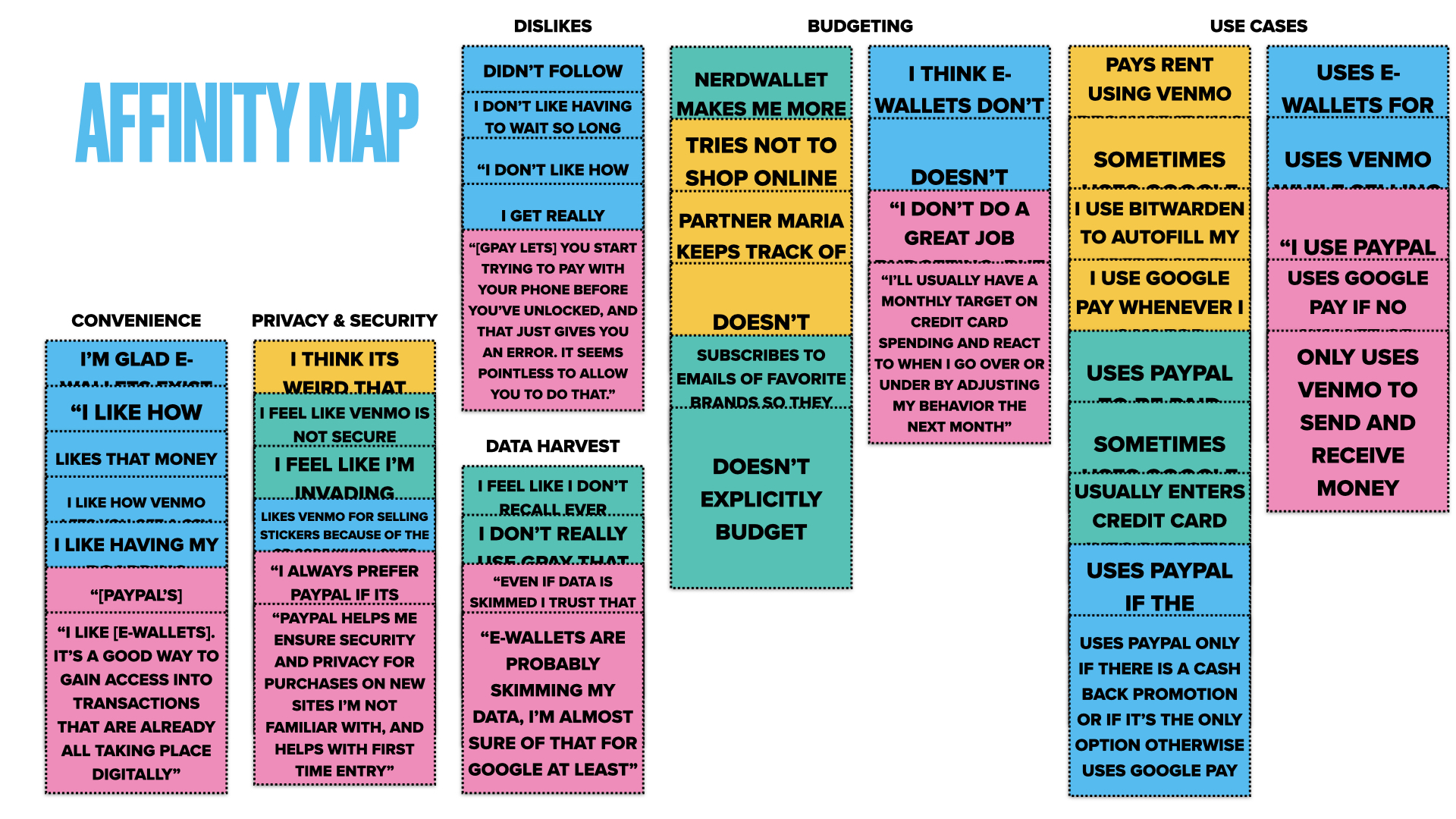
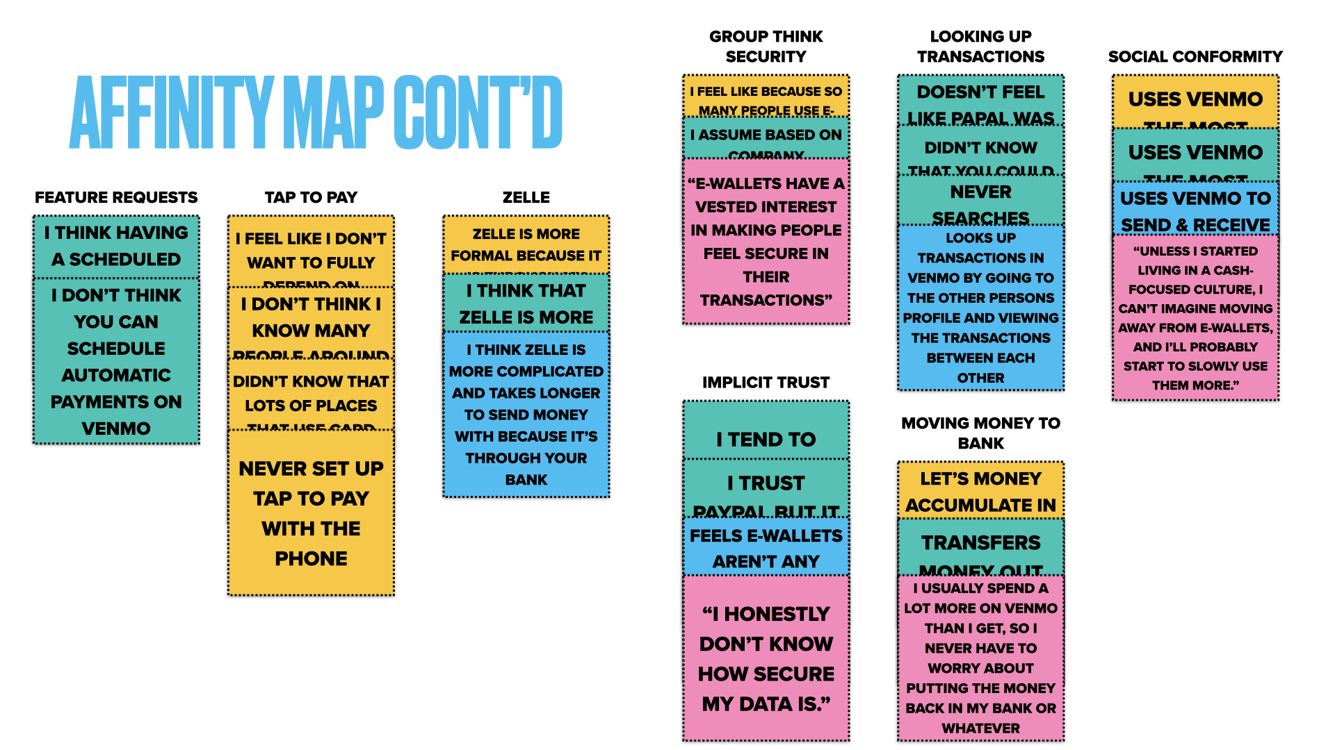
The interviews generated a lot of data across six themes: convenience, privacy & security, dislikes, data harvesting concerns, budgeting behaviors, and use cases. Affinity mapping let me pull recurring patterns out of the noise and identify what actually mattered most to users.
The quotes that surfaced most clearly: “PayPal helps me ensure security and privacy for purchases on new sites I’m not familiar with, and helps with first time entry” — and on the other end of trust, “E-wallets are probably skimming my data. I’m almost sure of that for Google at least.” Privacy wasn’t just a preference; for many users it was a precondition for using the app at all.
The core insight: users want convenience and consolidation, but only if they trust that their data won’t be shared or exposed without their knowledge. That shaped PlutoPay’s core value proposition.
User Personas
From the research themes, I defined three personas representing distinct relationships with digital payments. These weren’t just demographic profiles — they captured different mental models, frustrations, and goals that I returned to when evaluating design decisions.
Lacy, 20 — Interior Designer, New York, NY is always on the go, constantly buying items for clients and splitting bills with roommates. She needs payment to be fast and private, hates troubleshooting app issues when she has no time, and uses Venmo frequently — frustrated that it doesn’t have autopay. Her core need: “I’m constantly buying items for clients so I need checkout to be fast.”
Jazz, 27 — Etsy Shop Owner, Denver, CO runs a small business selling art and needs to track business transactions separately from personal spending. She’s frustrated by hidden fees, time-consuming customer service, and business bookkeeping overhead. Privacy matters: she uses Venmo specifically because it gives her privacy when selling in person. Her core need: “Venmo gives me privacy when I’m selling my art in person to customers.”
Sam, 24 — Social Media Manager, Seattle, WA is impulsive about shopping and forgetful about bills — their ADHD makes budgeting stressful rather than empowering. They want convenience above all, need bill pay reminders or autopay, and are constantly losing their wallet. E-wallets are a genuine relief for them: “I’m glad e-wallets exist because of how convenient they are.”
Together these three personas covered the primary needs PlutoPay had to address: speed and privacy (Lacy), business transaction tracking (Jazz), and budget-aware spending with reminders (Sam).
Journey Mapping
I mapped the current-state experience of each persona making an online purchase — capturing their actions, thoughts, and emotional highs and lows at each phase. The journey maps surfaced two consistent pain points: the anxiety of entering card details on unfamiliar sites, and the frustration of realizing they’d gone over budget after the fact. These two moments became primary design targets.
Lacy’s journey centered on ordering food on the go. The emotional low hit early — restaurant sites aren’t mobile-friendly and take forever to navigate — then recovered at checkout when PlutoPay handled the payment cleanly, before dipping again at pickup. Opportunities: make the experience mobile-first, offer express checkout, enable bill splitting.
Jazz’s journey was about doing taxes and needing a clean transaction list. She started frustrated, relieved once she found the filter, but ended wanting PlutoPay to calculate totals for her so she wouldn’t need Excel at all. Opportunities: streamlined transaction navigation, CSV export, and income total calculations.
Sam’s journey was a simple peer payment — paying back a friend for a vacation. Emotionally low at the start (embarrassed about forgetting), but the actual payment flow was smooth enough that Sam finished satisfied. Opportunities: payment request flows, tip/tax calculators, payment method switching, and clearer in-progress communication.
Ideation and Design
Empowered with research, I moved into designing the actual experience — starting broad with what screens were needed and progressively narrowing toward a testable prototype.
User Flows
Before sketching screens, I mapped the key user flows: onboarding, sending money, and searching for a payee. This let me identify every decision point a user would encounter and estimate screen count before committing to visual design. It also revealed a few redundant steps I cut before they made it into wireframes.
Site Map
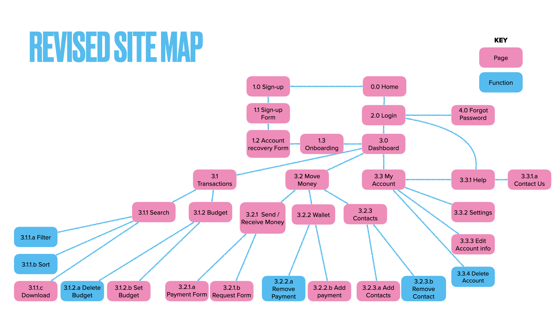
With the flows defined, I created a site map to establish the full information architecture. I went through several iterations — early versions had too many top-level sections, which would have made navigation feel heavy for a task-focused app. I consolidated until the architecture reflected what users actually need to do, not everything the app could theoretically offer.
Wireframing: Low to High
Low Fidelity
I started with hand-drawn wireframes to work out the basic layout of each screen without getting attached to visual details. My focus: what elements does a user need on each screen to complete their task, and in what order? I drew from the competitive analysis throughout — if PayPal placed a control in a confusing location, I wanted to understand why before copying or avoiding it.
Mid Fidelity
Moving to mid-fidelity, I shifted focus to content: what text does each button carry, what do input labels say, what does the empty state look like? This is also where I built the first prototype and ran user testing.
One early idea I was attached to: a pay/request slider that let users toggle between modes on a single screen. It felt elegant — one control instead of two buttons. I A/B tested it against a two-button layout. The results were decisive: 79% of users preferred the buttons, and 50% of testers showed outright confusion with the slider. Users wanted clarity over cleverness. I replaced it with two clearly labeled Pay and Request buttons — less interesting, significantly more usable.
“79% of users wanted buttons with words on them.”
High Fidelity
With mid-fidelity testing complete, I moved into high-fidelity screens — establishing a design language including color, typography, imagery, and detailed input states. I paid particular attention to error states: for a payment app, an unclear error message at the wrong moment is a trust problem, not just a usability problem.
Prototyping and Testing
I built an end-to-end prototype and ran it through two rounds of feedback: structured user testing and peer design review.
User Testing Results
Testing surfaced three clear findings worth acting on:
Missing input labels on sign-up. The sign-up form used placeholder text inside fields rather than persistent labels above them. One tester flagged it directly, and it turned out many others had found the form confusing without pinpointing exactly why — the absence of labels broke the consistency they expected from every other input in the app. Fix: added persistent labels above each field.
No way to edit at confirmation. On the payment confirmation screen, users had no way to go back and correct a mistake short of canceling the whole flow and starting over. One tester caught this explicitly — if they spotted an error on the confirmation page, they’d have to restart entirely. Fix: added a back button to the confirmation screen.
Slider vs. buttons (A/B test). As noted above, the pay/request slider was tested against a two-button layout. 79% preferred buttons, 50% showed confusion with the slider. The slider was removed.
Peer Collaboration
I shared the prototype with my design community for an additional round of feedback. Three changes came out of it:
Button sizing. Peer reviewers flagged that the button size-to-text ratio on the start screen was disproportionate — the buttons were too large relative to the 14pt text. Resolution: reduced button sizing to restore proportion without changing the text size.
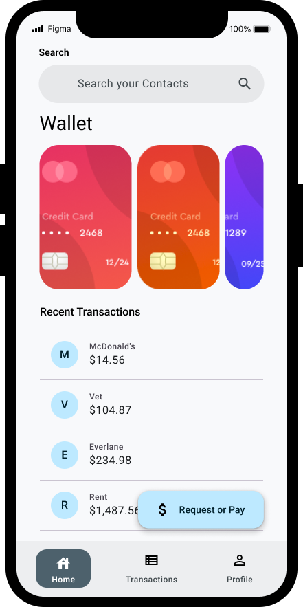
Transaction data density. The transactions screen showed “List item” placeholder text throughout rather than realistic data, making it hard for reviewers to evaluate whether the layout actually worked. Reviewer Olivia M: “For a high-fidelity prototype, it would be helpful to see what this screen would really look like for the user.” Fix: populated the transactions screen with realistic merchant names and amounts (McDonalds, Vet, Everlane, Rent, etc.) so the information hierarchy could be properly evaluated.
Missing forgot password. The login screen had no forgot password path — a gap that’s easy to miss when you’re focused on the happy path. Reviewer Olivia M flagged it; Teresa Rodriguez-Hong agreed. Fix: added a “Forgot Password?” link below the password field.
Accessibility
This section reflects something I brought directly from my engineering background: I’ve received a lot of design handoffs in my career that were completely silent on accessibility, leaving developers to make interaction decisions that should have been made in design. I didn’t want to do that to anyone working from PlutoPay’s specs.
I used Deque’s axe plugin in Figma to annotate every screen with the accessibility attributes developers would need: ARIA roles, focus order, label associations, and interaction states for screen reader users. The goal was that a developer could implement these screens without guessing at a single accessibility decision.
I also applied peer feedback on accessibility — adjusting color contrast ratios, increasing touch target sizes, and ensuring error messages were surfaced in a way that would be communicated to assistive technology, not just displayed visually.
Design System
After finalizing the UI, I documented PlutoPay’s design language — color, grid, typography, imagery guidelines, and a component library. This served a dual purpose: it locked in visual consistency across the prototype and created a reference any future designer could pick up and work from.
I intentionally modeled this closely on Material Design. As someone newer to design systems at the time, studying how Google approached component documentation, token structure, and usage guidelines gave me a much stronger foundation than starting from scratch. Learning the conventions of a well-established system before diverging from it is a decision I’d make again.
Reflections
The slider was a good failure. I went into A/B testing attached to the pay/request slider — it felt elegant and I’d put real thought into it. 79% of users wanted buttons with words on them. Killing it was the right call and a useful reminder that the most interesting interaction isn’t always the most usable one.
Working alone is a risk. For most of this project I had no design teammates to pressure-test ideas against. The peer review round caught real problems — including a missing forgot-password flow that I’d simply overlooked in the happy-path focus of early iterations. I build in peer review earlier and more often now, not as a final check but as a design tool.
Designing for the handoff changes how you design. Coming in as an engineer who had worked from underspecified design files, I had strong opinions about what a useful handoff looks like. The accessibility annotations weren’t a checkbox — they were me trying to be the kind of designer I wished I’d been handed specs from. That perspective has shaped every design systems role I’ve had since.