Visa’s Product Design System gives developers individual components — buttons, inputs, navigation bars. But developers don’t build apps from isolated components. They build application layouts: full-page patterns that combine navigation, content areas, and footers into something that actually works.
Patterns was built to close that gap. It’s a section of VPDS where common UI patterns come pre-assembled, documented, and ready to download. Instead of hand-wiring a horizontal application layout from scratch, a developer can grab the pattern, start from working code, and focus their energy on the product logic that actually differentiates their application.
I designed and built the Code tab — the core developer experience on every pattern page — and contributed to the overall page layout design alongside the UX team.
The Page Layout
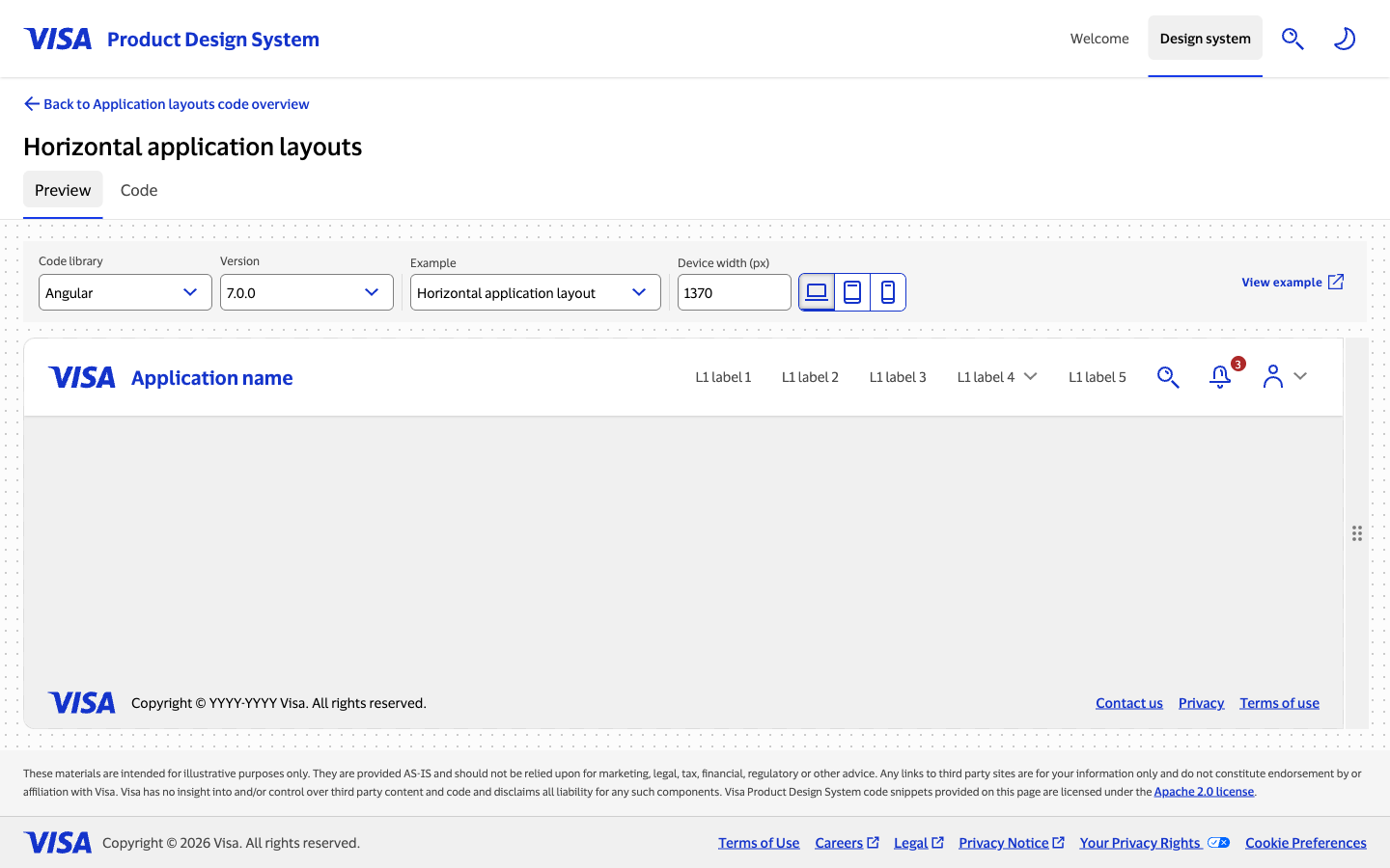
Each pattern page has two tabs: Preview and Code. On the Preview tab, users can see a live render of the pattern at different device widths. On the Code tab, they can explore the source and download it.
Originally, the UX designers placed the Preview/Code tabs below the toolbar with the code controls — code library, version, example selector. It made visual sense; the tabs felt like part of the content configuration.
But as I worked closely with Visa’s accessibility experts, a WCAG requirement surfaced that changed that decision. The controls in the toolbar change depending on which tab is active: the Preview tab shows device-width controls and screen-size preset buttons, while the Code tab shows a split-slider input and a Show/Hide API reference button. Under WCAG guidelines, a control that changes page content must either announce that change programmatically to screen readers, or be placed above the content it affects in the page hierarchy.
I evaluated both paths — engineering the screen reader announcements or redesigning the page — and made the call that moving the tabs was the cleaner solution. Adding dynamic announcements for every control state introduced complexity that would be fragile to maintain; redesigning the layout was a one-time cost that made the page structurally correct rather than patched. I brought this to the UX team with the reasoning, and they agreed. The tabs moved to the top of the page hierarchy, above the toolbar. The structural change solved the accessibility requirement without any runtime announcement logic.
The Code Tab
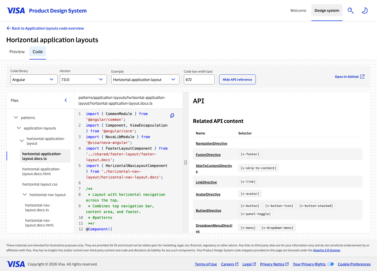
The Code tab is a three-panel split view: a collapsible file tree on the left, syntax-highlighted source code in the center, and an API reference on the right. The split between code and API is resizable via a drag handle.
Why a code editor layout
The patterns audience is developers. I designed the file tree and code panel by looking at what developers already know — code editors. The structure is familiar: a tree of files on the left, the selected file’s contents on the right, syntax highlighting throughout. Meeting developers in their native environment meant they didn’t have to learn a new interaction model to get to the code they needed.
Building the code viewer from scratch
The team explored using existing npm packages for the full code viewing experience. Licensing reviews by legal blocked the broader packages — the available options introduced intellectual property exposure that Visa wasn’t willing to take on. The solution was a hybrid: syntax highlighting came from a vetted npm package, while the file tree, navigation, copy controls, and layout integration were built in-house.
That constraint turned out to shape quality. The custom-built pieces were designed specifically for this context — the file types in a VPDS pattern, the copy-and-download workflow, the integration with the resizable layout — rather than bent from a general-purpose library.
The API reference: scope creep with a design problem
Halfway through development, a requirement surfaced: the pattern code pages needed an API reference table so developers could see which directives and selectors came from which components. The feature made sense. Where it should live on the page did not.
The team worked through several placement options. I built quick prototypes — including a split-panel version with AI assistance — to give everyone something tangible to react to rather than debating wireframes. The split screen concept got immediate positive feedback. People could see code and API simultaneously without losing context on either side.
That prototype became the design. We formalized it using the same drag handle interaction already present on the Preview tab — a grab handle that users could drag to shift the division between code and API. Consistency across tabs mattered: one interaction pattern for resizing, regardless of which tab you were on. A Show/Hide API reference button was added on top of that, letting users collapse the API panel entirely when they wanted to focus on code.
The Preview tab resize
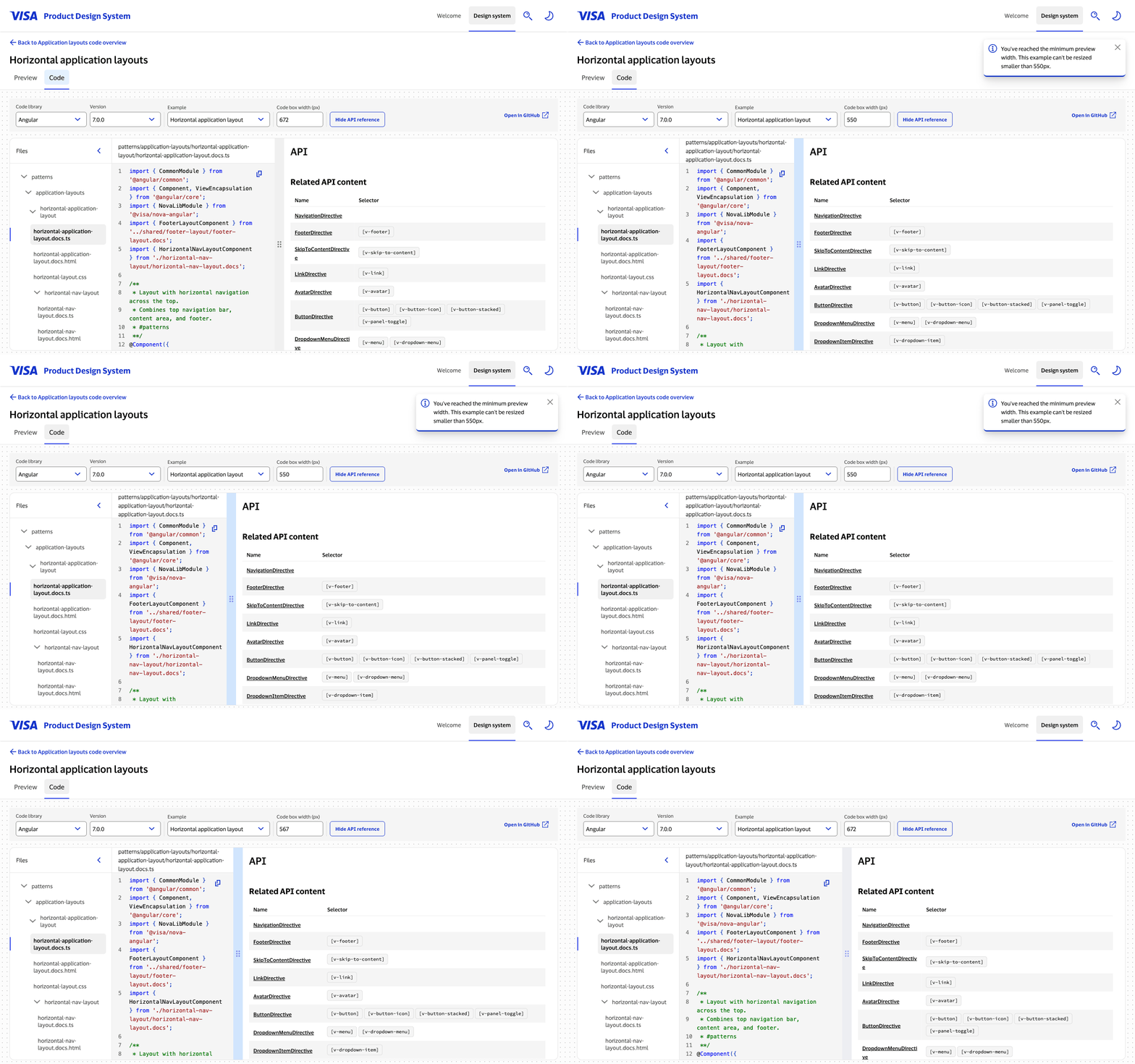
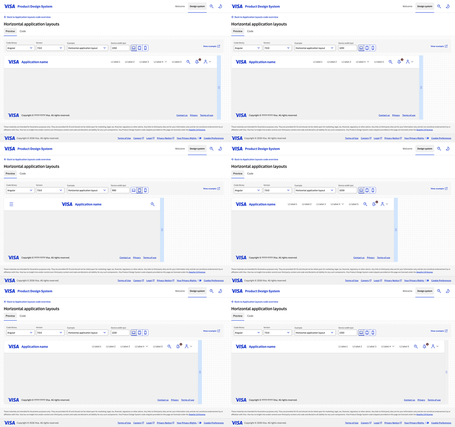
The Preview tab’s device-width resize was built by another engineer on the team. I refactored her implementation to work across both pages — abstracting the resize logic so it could power the Preview tab’s viewport simulation and the Code tab’s panel split from the same foundation.
Mobile
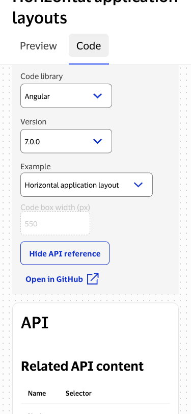
On mobile, the split panel layout doesn’t make sense — there isn’t space to show code and API simultaneously in a useful way. The decision was to show one or the other, with the width-resize controls disabled. Mobile was not a priority for the team; the target audience for Patterns is developers actively building, who are almost certainly on desktop. The mobile experience was designed to be functional and accessible, not polished — a reasonable tradeoff given where user attention actually was.
The Hardest Part: Edge Cases
The most sustained engineering challenge wasn’t building the features — it was handling what happened at the boundaries. The page is deeply dynamic: controls that change based on tabs, a resizable split that can go to extremes, device-width simulation that interacts with the split state.
What do you show when the user drags the split to nearly zero or full width? What controls appear in the toolbar when the user is viewing a mobile breakpoint? What happens when the split state persists across a tab switch? Each question seemed small in isolation and compounded quickly. Managing the state correctly across all these dimensions — dynamic pages within dynamic pages — required careful thought about which states could coexist and which needed to reset.
Impact
Patterns launched in October 2025. The Code tab layout was novel enough that Visa’s legal team explored filing a patent on it — the combination of a resizable code/API split with a shared drag handle interaction was considered genuinely new in the design system space. The process ultimately resulted in a legal publication rather than a patent filing, but the evaluation itself reflects how unusual the design was.
Reflections
Prototypes beat debates. When the API reference placement became a multi-stakeholder design problem, the fastest path forward was putting something interactive in front of people. I built a working prototype of the split screen quickly — with AI assistance — specifically to give the team something to react to. The prototype built consensus in a way that wireframes hadn’t. When everyone can feel what it’s like to have code and API side by side, the decision makes itself.
Accessibility decisions are engineering decisions. Identifying the WCAG issue with the tab placement required understanding both the requirement and the implementation tradeoffs. Knowing that adding screen reader announcements would create fragile, hard-to-maintain logic — versus a structural layout change that was clean and permanent — was what made it possible to make a confident recommendation to the design team. A11y expertise that stops at “this is a requirement” isn’t enough; the value is in knowing what the right fix is.
Constraints produce better design. Not being able to use an off-the-shelf code viewer meant building exactly what the use case needed. The custom implementation is smaller, more focused, and better integrated with the resize logic than any library would have been. The licensing constraint that felt like a setback turned out to enforce a higher design standard.