Visa’s Product Design System (VPDS) had just gone public when the team started noticing a shift in how developers were actually using documentation. People weren’t just reading component pages — they were copying them into ChatGPT and Claude to help write implementation code. But there was no clean way to do that. Users were manually selecting, copying, and reformatting page content, losing structure and fidelity along the way.
I designed and built a set of page-level actions to close that gap. The goal was simple: let developers bring design system documentation into their LLM workflow with one click, without losing the structure that makes the content useful.
The Problem
VPDS launched publicly serving 14,000+ active users across Visa. As LLM-assisted development became the norm, developers were increasingly pulling documentation into tools like ChatGPT and Claude to help with component implementation — but the workflow was painful. Manual select-all captured the wrong content, lost structural fidelity, and gave the model a garbled mess to work from.
The team’s goal was to make VPDS documentation AI-ready. The question was how to do it in a way that was fast, discoverable, and actually produced clean output.
Design Decisions
Placement and visibility
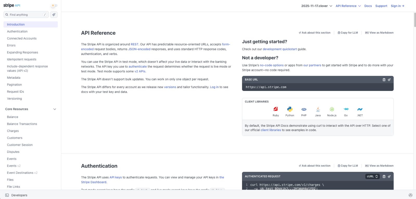
I started by looking at how other developer-facing doc sites were handling this. Stripe’s API reference had added per-section “Copy for LLM” and “View as Markdown” buttons anchored to each heading. Cloudflare Docs shipped a “Copy page” dropdown that could open the page directly in Claude or ChatGPT. Both confirmed the pattern was worth building — but neither mapped directly to VPDS’s page structure.
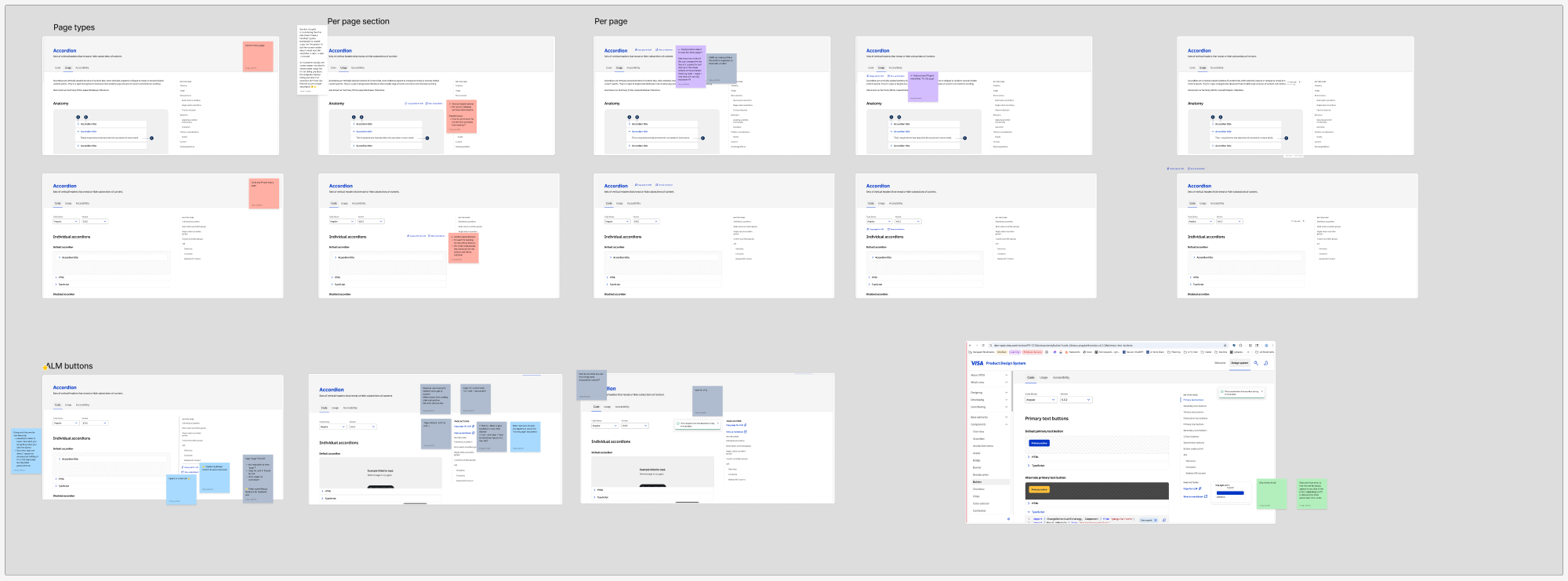
I explored three distinct placements:
Per-section buttons at each h2. The Stripe model — surfacing copy actions at the section level so users could grab exactly what they needed. The problem: VPDS pages have introductory content that sits above the first heading, so section-level buttons would silently omit it. On code pages with version and library dropdowns, the scope got even murkier: copy this section for which version, which library?
Floating buttons near the page h1. A page-level action with clear scope that stays visible as users scroll. But VPDS component pages open with Code / Usage / Accessibility tabs, which immediately raised a question: does the copy include the current tab, or all three? Either answer created confusion about what the user was actually getting.
Right sidebar, above “On This Page.” What shipped. The sidebar placement makes scope obvious before you click — it’s the whole page, the thing the sidebar already describes. No layout shift, no interaction with tab state, and it lives in the same column as the table of contents, where utility tooling naturally belongs.
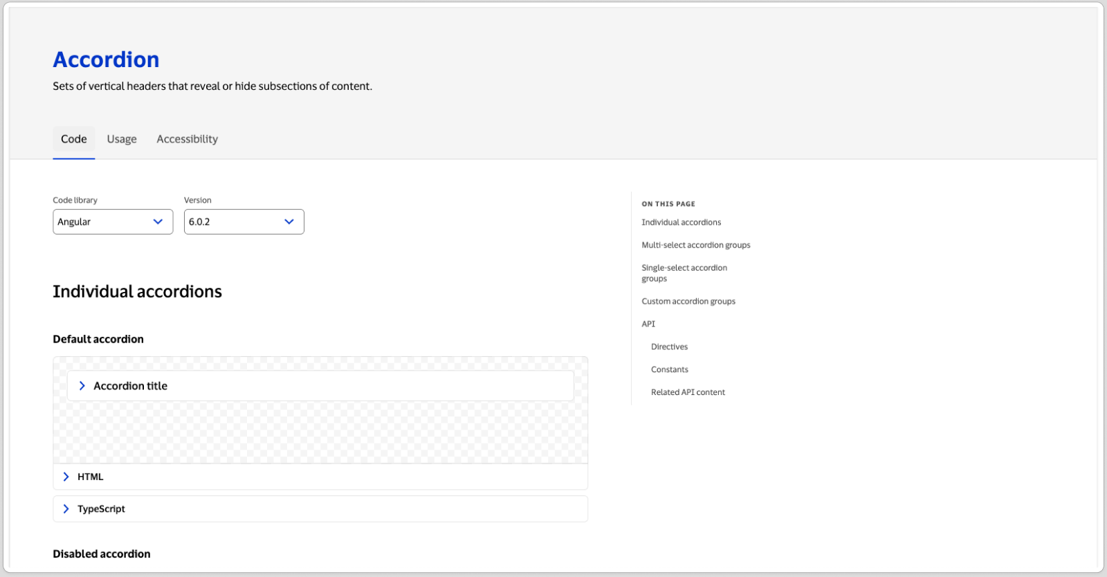
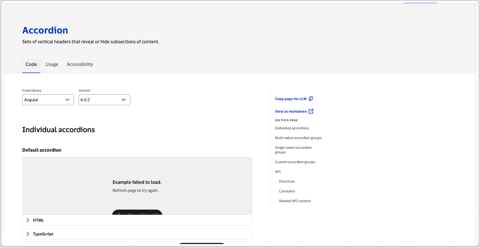
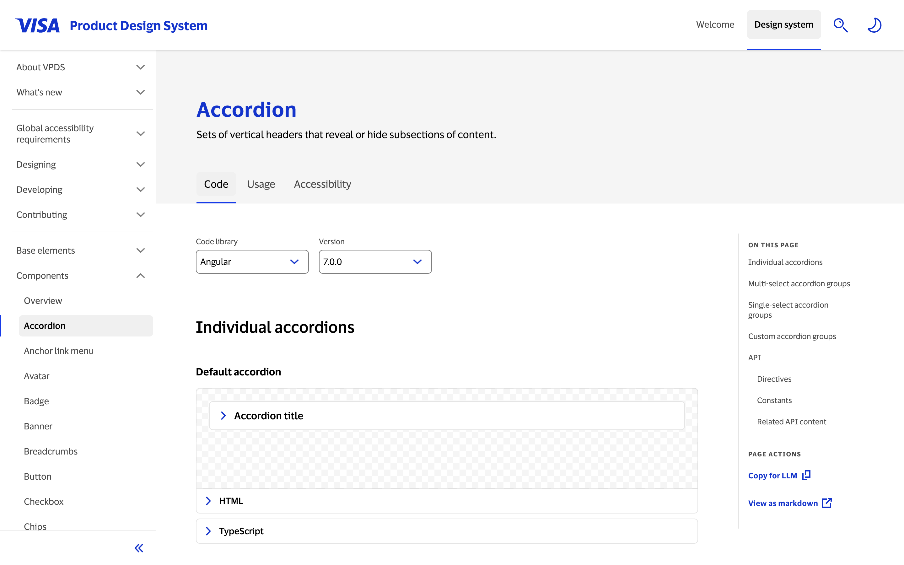
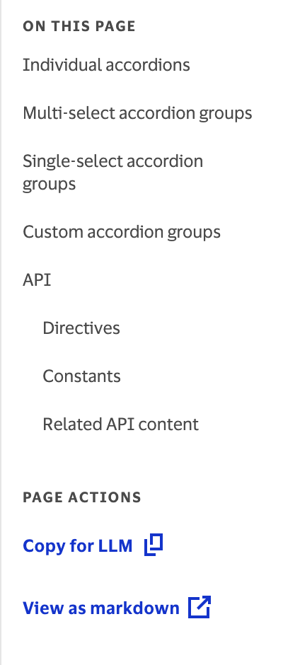
The audience informed the details throughout. Developers reading documentation sidebars have a high tolerance for utility-focused interfaces. I kept labels direct and assumed familiarity with markdown rather than over-explaining.
Interaction model
I designed two complementary actions:
Copy for LLM copies the current page’s content to the clipboard in one click — the fastest path from docs to LLM prompt. View markdown opens the raw markdown in a new tab, letting users preview and selectively copy sections before pasting.
The label “Copy for LLM” was questioned in review — it can read as robotic or tool-specific. But for this audience, the precision is the point: developers reaching for this button know what an LLM is and why they’d copy docs for one. Softening the label would trade clarity for tone.
Each action includes confirmation feedback so users know it worked. The copy action shows a toast — essential for keyboard users who can’t see a cursor change. The view action carries an aria-label noting it opens in a new tab, which serves as its own confirmation.
Markdown conversion quality
This was the hardest part. Design system documentation pages are structurally complex — they include code blocks across multiple frameworks (React, Angular, Styles/CSS, Flutter), data tables, nested lists, image references, and custom components like live code previews.
Getting the markdown output to be clean and actually useful when pasted into an LLM required careful handling of each content type. Code blocks needed language tags preserved. Tables needed to render as markdown tables, not visual noise. Custom components that don’t translate to markdown needed to be omitted gracefully rather than output as broken HTML strings.
The bar I held myself to: a developer should be able to paste the output directly into a prompt and get useful results back. Not a lossy copy that would confuse the model — documentation-quality markdown.
Impact
Recently shipped — quantitative adoption data is still being collected. The feature directly supports the team’s goal of making VPDS documentation AI-ready, positioning Visa’s design system ahead of most enterprise design systems that haven’t yet adapted for LLM workflows.
The feature works on every public documentation page, covering the full component library across all supported frameworks.
Reflections
Markdown quality is a UX problem. Most of the design work here wasn’t visual — it was deciding how to represent each content type in a way that would be useful after leaving the page. A clean component table in markdown versus a broken HTML fragment is the difference between a prompt that works and one that produces hallucinated API shapes.
The audience changes the design. Knowing I was designing for developers, not general users, let me make decisions I wouldn’t make for a broader audience: terse labels, no instructional copy, confirmation feedback that gets out of the way quickly. Matching the vocabulary and mental models of the people using the feature is part of the design.
Building bridges between tools is valuable work. This wasn’t a new component or a redesigned page — it was making existing content work better in a context the original authors hadn’t anticipated. That kind of forward-looking infrastructure work is often undervalued, but it compounds. Every documentation update automatically becomes better LLM input without anyone doing extra work.