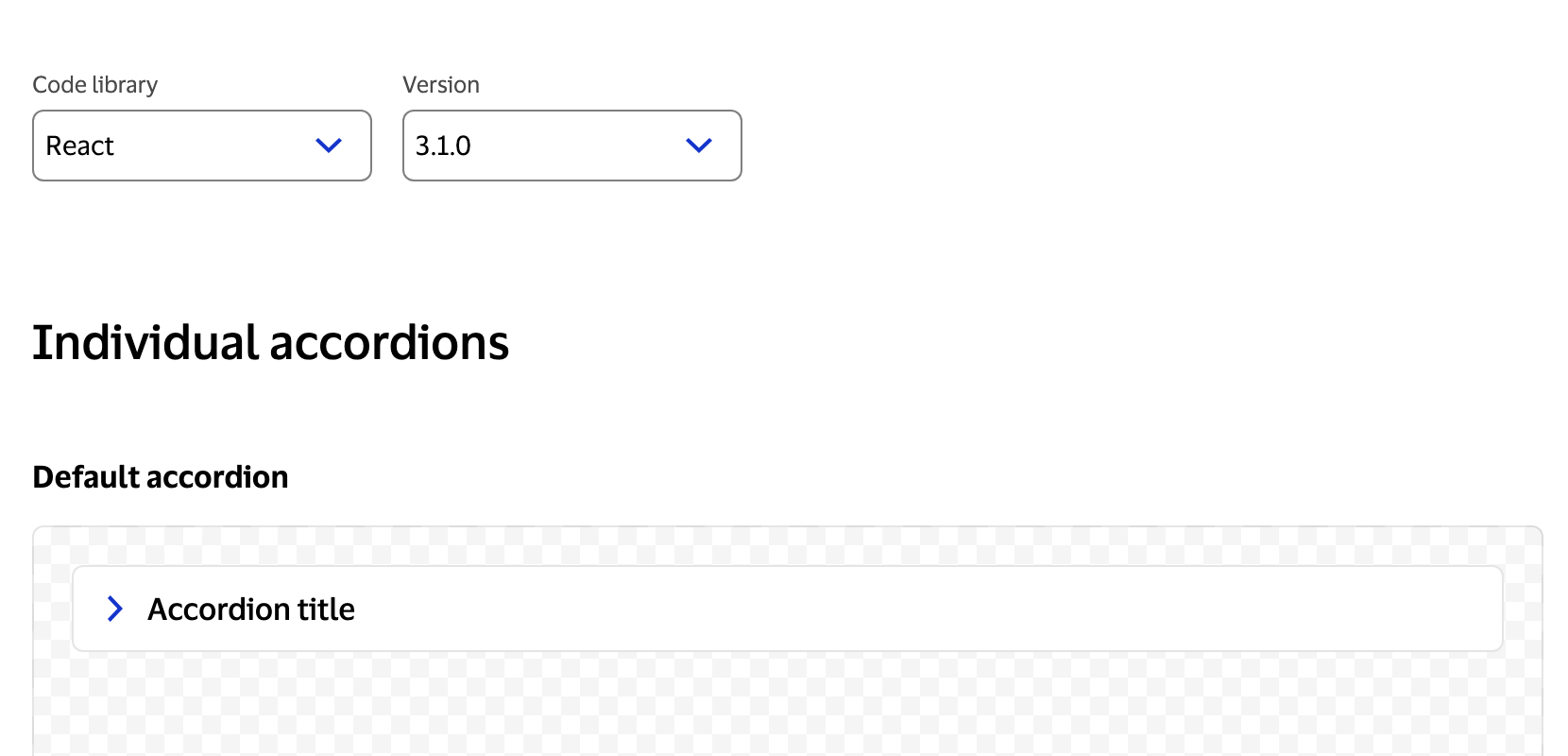
Visa’s design system supports components across multiple front-end frameworks — React, Angular, Styles/CSS, Flutter — each with multiple supported versions. Developers using the documentation need to see code examples that match their stack. Without a code switcher, the docs would either need to show every variant at once (overwhelming) or default to one framework (unhelpful for most users).
I was the engineering owner of the code switcher that shipped with the public launch of design.visa.com. The UX was designed by our design team; my role was building it, owning the technical architecture, and being a close collaborator on the decisions where engineering constraints shaped the interaction. A meaningful part of how I work with designers is translating what’s technically possible into concrete options they can choose between — showing tradeoffs in terms of user experience rather than implementation complexity. This component had several of those moments.
The Problem
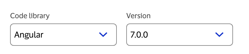
The documentation site needed to serve developers working across a matrix of frameworks and versions. React 18 and React 17 have meaningfully different component APIs in some cases; Angular, Styles/CSS, React, and Flutter have entirely different patterns. A single static code block couldn’t do the job.
The challenge wasn’t just building a tab switcher. It was building one that handled the full matrix of frameworks and versions gracefully — including the cases where an example didn’t exist yet, and the problem of what happens when a user’s preference can’t be honored on a given page.
A Novel Design Decision: Page-Level vs. Global Switcher
Most documentation sites that support multiple framework versions — Material UI, Chakra, and others — solve this with a global version switcher in the navigation that changes the entire site. We looked at that pattern and rejected it.
The reason: our situation was different. VPDS supports four frameworks, each with multiple versions, and not every component has examples for every framework. A global switcher would constantly lead developers to dead ends — selecting Angular at the site level only to land on a component that doesn’t support it.
The decision the team landed on was to make the switcher a page-level control, scoped to each component’s documentation. This meant the switcher could reflect what was actually available for that component, rather than making a global promise the site couldn’t keep.
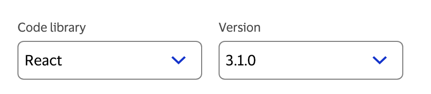
Moving the switcher to page-level introduced a new engineering challenge: how do you respect a user’s framework preference across pages when some pages can’t honor it? A developer who selects React shouldn’t have to re-select it on every page they visit — but if they navigate to a component that only supports Angular, something has to give.
Technical Approach
Hybrid persistence
User preferences are persisted using a combination of URL parameters and localStorage.
URL params handle shareability. If a developer sends a colleague a link to a component page with React 18 selected, the colleague sees React 18. The framework selection is part of the URL, not hidden in session state.
localStorage handles cross-page navigation within a session. Users shouldn’t have to re-select their framework on every page they visit. Once you’ve told the site you’re a React developer, it should remember that until you change it.
The two mechanisms work together: the URL takes precedence (for shared links), and localStorage fills in the default when the URL doesn’t specify.
Handling unsupported libraries gracefully
When a user navigates to a component page that doesn’t support their selected library, the site auto-switches to a supported library for that component — but doesn’t do it silently. A flag notification appears in the lower right of the page letting the user know the library has changed and why.
Silent switching was explicitly ruled out. From an accessibility standpoint, when state changes on a page, users need to be informed — especially screen reader users who won’t visually notice that the code examples have changed. The flag notification was chosen over a toast because it’s persistent rather than transient, giving users time to register the change rather than missing a message that disappears in seconds.
Edge case handling
Not every component has examples for every framework/version combination. Some are in progress. Some have been deprecated. The switcher needed to handle these gaps without leaving users staring at a blank code block or an unexplained missing state.
The cases I built for:
- Example not yet available: Show a clear, specific message — not a generic error, but something that tells the user this combination is coming and what to do in the meantime.
- Version deprecated: Surface a deprecation notice when the user selects a deprecated version, with a prompt to upgrade.
- Framework not supported for this component: Disable the unavailable frameworks in the selector rather than letting users select them and hit a dead end.
Getting all of these right required enumerating states systematically rather than building to the happy path and patching problems later.
Impact
The code switcher is a core piece of the documentation experience for every component page on design.visa.com. It directly supports the site’s multi-framework strategy and reduces friction for the 14,000+ users navigating the system.
Without it, developers using Angular would be reading React examples and translating manually. With it, each developer sees documentation that matches their stack from the moment they land on a page.
Reflections
Rejecting an industry pattern requires understanding why the pattern exists. The global nav switcher works well for single-framework version upgrades. It breaks down when you have a heterogeneous matrix of frameworks with uneven support coverage. Understanding the underlying problem the pattern solves — rather than just copying the solution — is what let us identify why it wouldn’t work here.
Accessibility shapes interaction design at the decision level. The flag notification wasn’t an accessibility afterthought — it was the reason we chose the notification pattern we did. When state changes on a page, assistive technology needs something to communicate that to the user. That requirement ruled out silent switching and shaped the final solution.
Translating constraints is part of the engineering role. The most useful thing I can bring to a design collaboration isn’t “that’s not possible” — it’s a clear picture of the options and what each one costs. For the persistence and notification decisions on this component, that meant showing the team what each approach would mean for the user experience before anyone had to commit to a direction.